
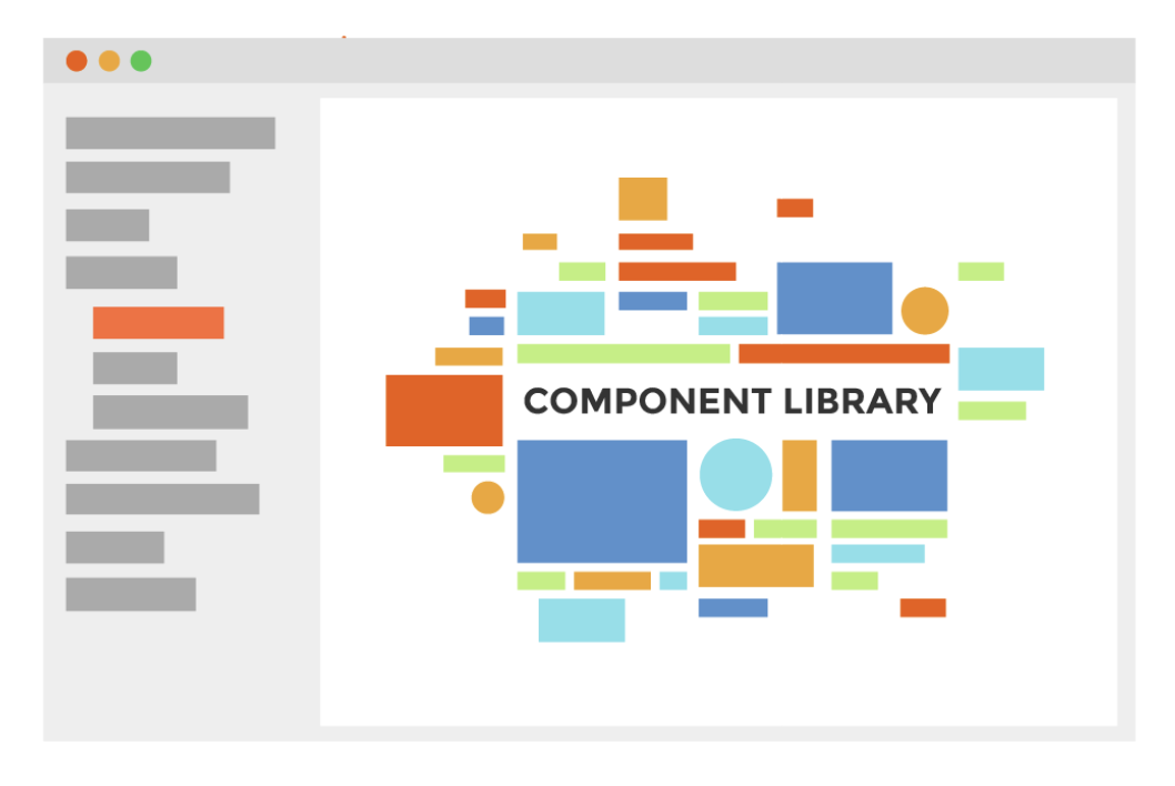
Design system: How to build a library?
Building a great UI library is not the same as creating a few components. There's so much more to it...

In the first part of the series, I shared my knowledge about How to build an engineering team? Now that we’ve built the team — let’s start building the Design system library (also called UI components library)!
While there are many articles about library development I personally found them focusing on different things than what I want to share here. Most of the articles primarily focus on the actual implementation of components, talking about specific frameworks to choose for the library, sometimes going as granular as showing exact configuration examples, etc… While it is useful, I’ve decided to share a different perspective — I want to share knowledge about features that I believe every good components library should have.
Choosing the approach
There are a couple of ways that you can choose to start building your library (there might be more ways but these are the ones I’ve had considered with my team):
1st option — build everything from scratch — it’s something that was rejected almost immediately. At that point, everyone on the team had already worked with either in-house developed or some open-source UI components library. The quality, functionality, robustness, and thought-through details were almost incomparable — popular open-source libraries could win easily in almost all aspects when compared to in-house solutions. We knew that without specific experience of building a library we couldn’t build better (considering time and resources constraints) and we also didn’t want to “reinvent the wheel”.
2nd option — find a themeable library and adapt to your needs — in one of my previous articles I’ve shared a link to a great resource where you can find and explore many great Design systems and their UI component libraries.
We used this resource extensively while researching 2nd option. After a while, we concluded — most Design systems are not flexible enough and we can’t theme them easily without creating a huge mess on top. We found a couple that is themeable, however, we rejected this option eventually as well because of the implied design requirements. We knew that we would be bringing in many unneeded and unapproved functionality without an easy way to disable or omit that if we chose only theming for a library.
3rd option — find a library that you use as a foundation and build on top. As saying goes “Third time is a charm” — and this was the choice that we made. While we were researching libraries that could be themed, we found a few good candidates, however, once we realized we would be “opening a pandora box” by going with a themed library we challenged ourselves with a question — what if we used one of those as a foundation and just built everything on top?
And so we had a “winner” — after careful consideration, we chose Material UI as a foundation for what later became our Design system library.
(Just to be clear, I’m not trying to advocate for Material UI, rather than explain how a mature library can serve as a solid foundation, choose the one to your own liking and requirements)
So what does it mean to use a library as a foundation? Well — we can take a component, provide style overrides to match our design requirements, pass through only the allowed props list, “proxy” certain functionality straight to the MUI component, or even create a custom component API.
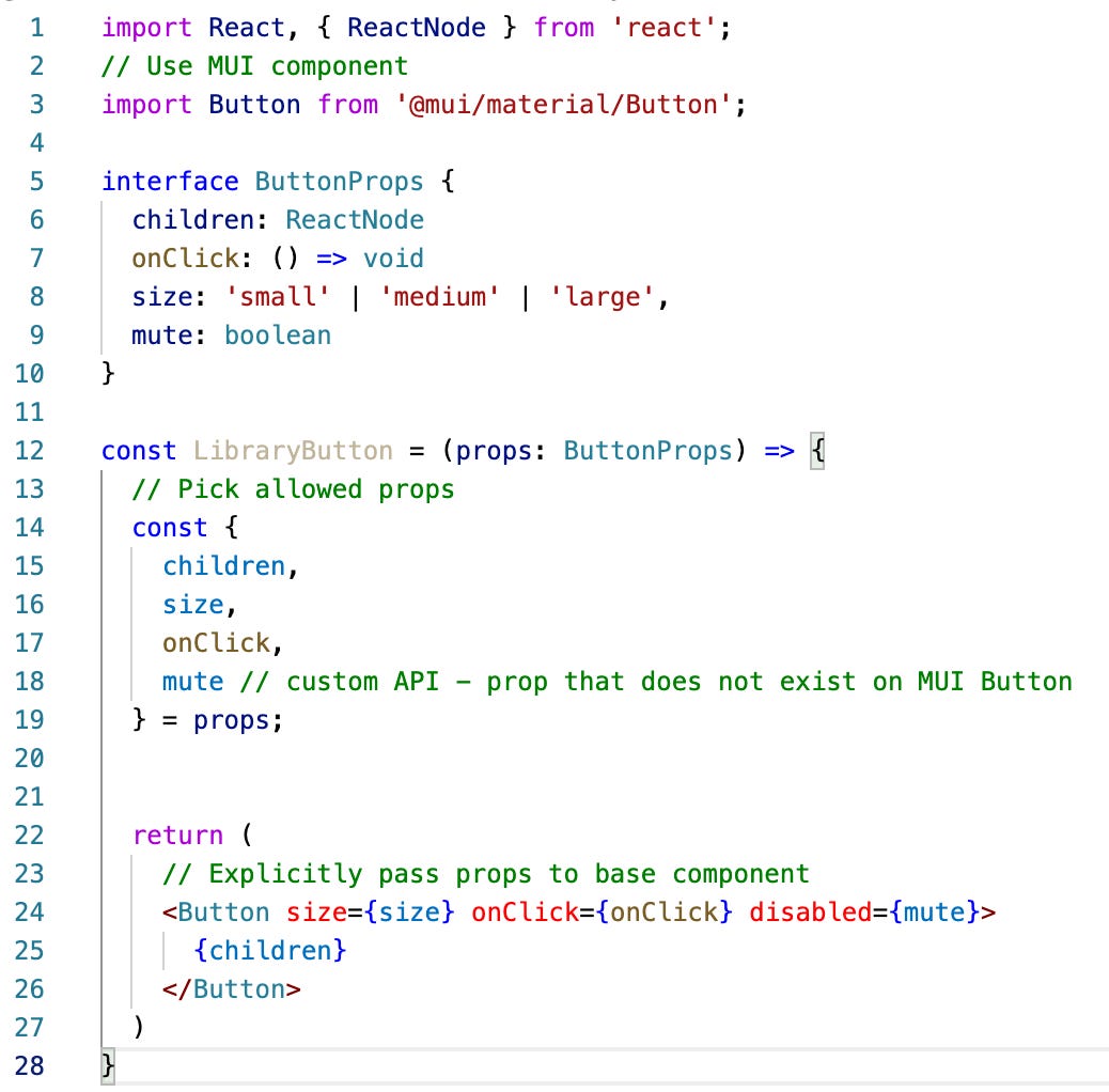
In the end, the goal is to almost entirely abstract base library usage, which eventually allows you to change the underlying implementation without breaking the libraries’ API.
Publishing your API documentation
Once we made a decision for our foundation we knew that we want to have an easy way to publish our components documentation. We didn’t look far actually — most of the team members have already used Storybook so it was almost an instant choice. In general, we found it to work really well, everyone was quite familiar with it and it provides tons of add-ons to customize certain features.
One thing in particular that we didn’t like was the way storybook renders stories — every story was rendered on a separate page, so in order to view the next story you had to move the mouse to the sidebar and click the next one
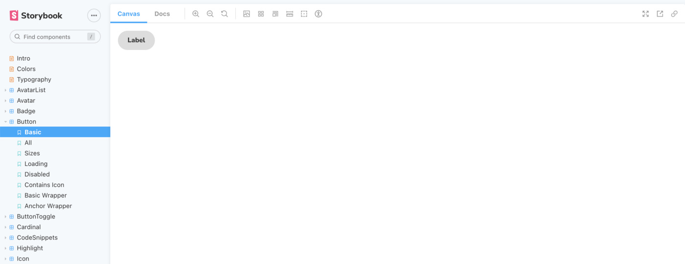
What we’ve done — we borrowed ideas from another great component’s library — Semantic UI (as you will later see we borrowed many great ideas from it) and rendered all stories on the same page. Now it was enough to open the component’s page and every example will be a few scrolls away:
Autogenerate component’s API
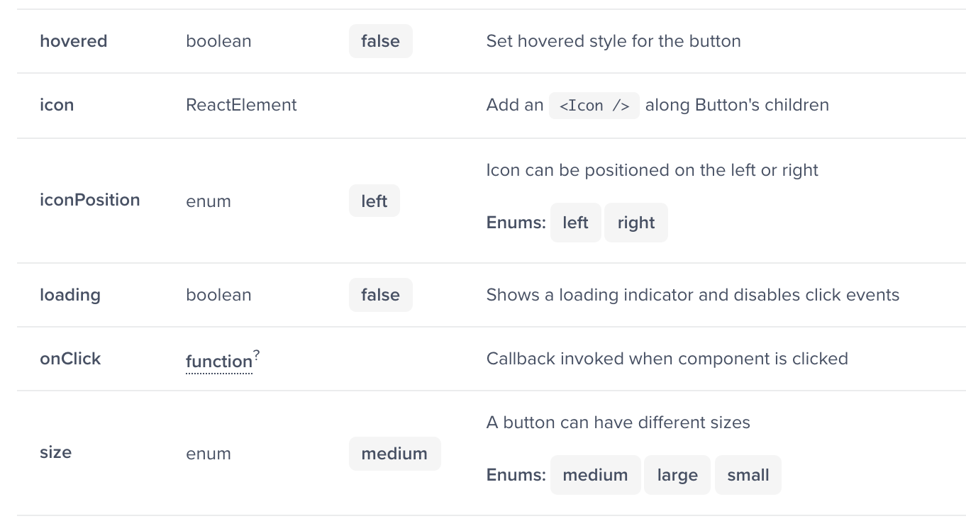
As we started building out our components and putting up documentation we realized that we really don’t want to keep writing props API manually. Not only that it’s very slow and tedious job it’s also very error-prone. Instead, we decided to look for tools that could generate props API automatically for us.
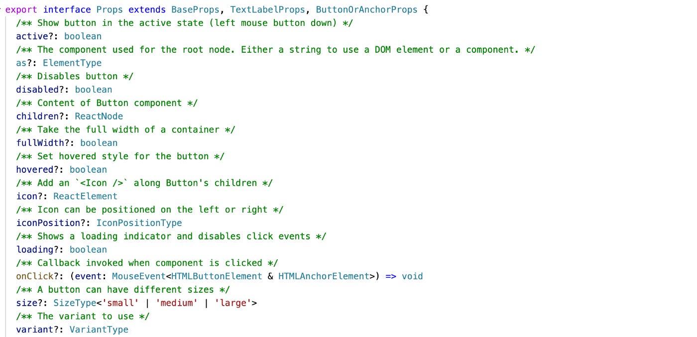
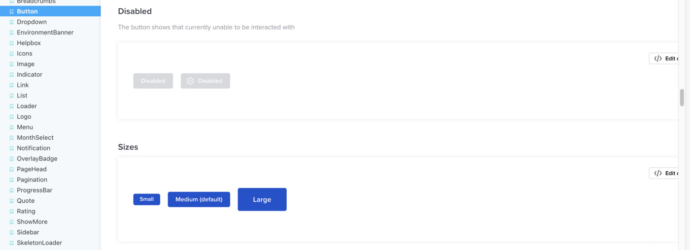
So we would take the component’s props interface definition and feed it to react-docgen-typescript which would later give us data structure, which we can render into human-readable and very developer-friendly documentation table
Handwritten real-world examples
At first, we also considered the option to autogenerate all of the stories/examples for our components, however, we soon realized that the end experience that it provides is not really satisfying us. Again looking for inspiration at Semantic UI we borrowed the idea to write each example separately. We did use automation to some degree — we had a scanner that would automatically pick up those examples so we don’t need to manually import each and every example.
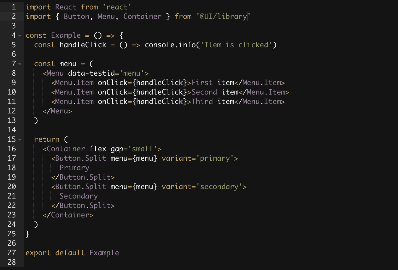
As you can see examples provided in the stories closely resembled real-world usages, hence it was veasy for any developer to copy this example and paste it directly into their code with a few minor modifications.
Interactive code editor
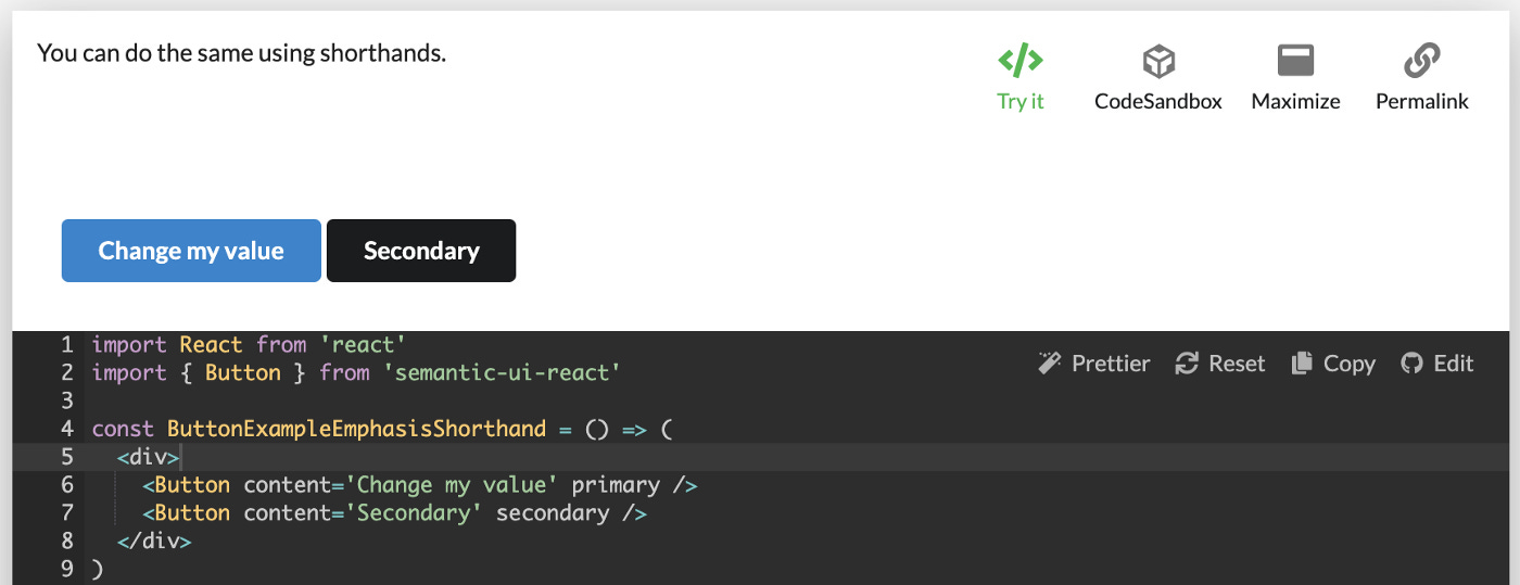
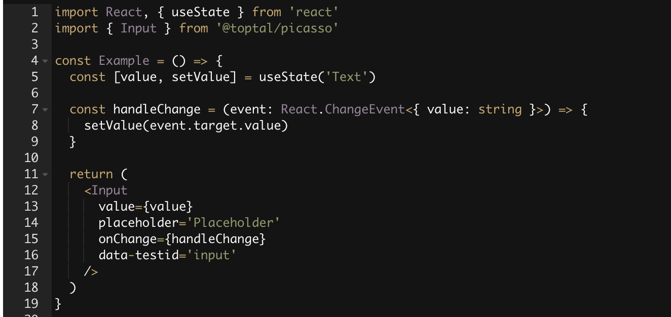
Another key feature that we added was an interactive code editor — this basically meant that as soon as you open-source code of component’s example you can modify code directly on the page — change values, import new components, etc… You basically had IDE inside the documentation (yet another great feature borrowed from Semantic UI). At first, it can seem like some shiny not very useful functionality, however only once you start using it you fully understand the value that it adds — you can rapidly prototype with components arrangement, test various cases with component’s API or even build full-blown layouts and copy it straight into your app’s code. Interactive code editor was also one of the reasons for writing real-world examples for our components.
Check it out to see how it works in real life, click “Try it” play around by changing different values, observe how examples are updated in real-time.
Quick linking
One more small and simple but really important feature was linking to an exact example. Given that all examples were rendered on the same page, it was extremely handy to have quick access to its anchor and copy it to a clipboard with one mouse click (“Permalink” button in the screenshot above)
Ensuring high quality
All the nice and shiny features of the library are not as important as its quality and reliability. Since the goal of the library is to provide building blocks and improve UI development efficiency — ensuring the high quality and reliability of the library was a critical and extremely important aspect.
It goes without saying that the first line of defense was unit-testing. However, you can unit-test only a limited amount of things in the UI components library. You can not really test style changes that can easily break layouts or otherwise lead to an unpleasant user experience.
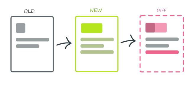
For that reason, we decided to use visual regression testing. What it basically meant is that we would take an image snapshot of each example in our library and store it along with the code as a baseline snapshot. Now when someone made a change we would run a CI job which would again generate snapshots for each example and compare them pixel-by-pixel with the baseline and report results. The best part was that this entire process was fully automated — the only thing we had to do is add a component example and the rest was done by software. If there was an issue detected we would immediately see that in our CI. This way of testing allowed us to catch far more issues than any other type of testing.
No matter how much testing we would add sometimes “life just happened” and bugs slipped into production. We would accidentally break some functionality in our library and potentially even block other teams. As a tool for potential damage control, we decided to use strict Semantic versioning and automatically generate changelog according to version changes.
It is easier to show than to explain — check out Picasso changelog. As you can see the major version is really high, however, it doesn’t mean that this is like the 17th revision of a library. Once you learn semantic versioning you realize that it’s just a number showing how many breaking or other types of changes you should expect, how to read the changelog, etc…
Using semantic versioning allowed the team to move more quickly as well as plan work ahead of time. For example — when you first start developing a library you might make many mistakes which you can fix only by breaking the API, hence you have to bump the MAJOR version, however, once you become more experience you learn to batch those breaking changes and plan major release every quarter or even less frequently.
Once you start planning your work ahead of time you are able to think of APIs that you are going to change or deprecate soon. This allows you to proactively inform users of your library about upcoming changes — you can use various logs in development mode warning users when they use APIs which are about to change. In general, you can establish certain deprecation strategies to help developers adopt future changes to the library.
Some other ideas to keep in mind that can improve the developer experience of your library are to provide migration strategies/guides whenever possible or even go as far as creating codemods for quicker code refactoring.
Establish easy to remember API principles
Learning from our own mistakes and also from other well-known libraries we decided to standardize certain API principles — patterns that are repeating from one component to another which are supposed to allow for more intuitive API usage:
Use same values when defining props that are repeating — size (small, medium, large), position (left, right), weight (thin, normal, bold), color (white, green, red, blue), etc…
Use a common name through the entire library if it’s controlling a similar aspect of component — variant, etc…
Always try to use the native equivalent of the prop name — disabled, value, onChange, etc…
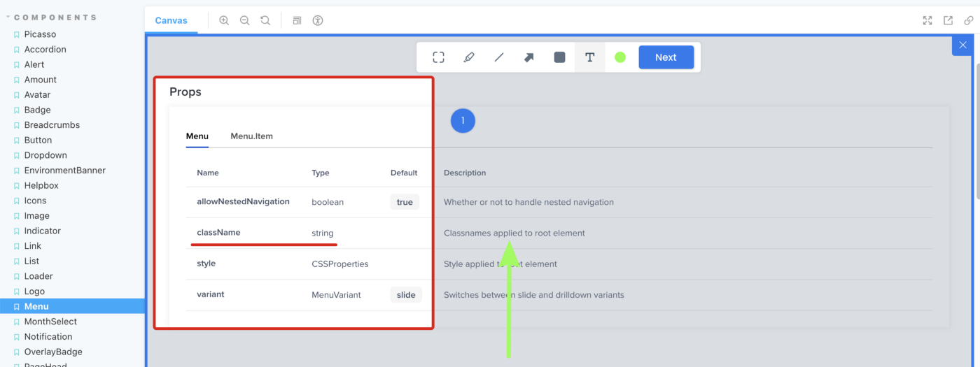
Use compound components when standalone components don’t make sense — Menu and Menu.Item (MenuItem as a standalone component couldn’t be used)
When you have easy to remember API in many cases you don’t even need to look at the docs, you already know a value or prop that you can use to get the desired effect.
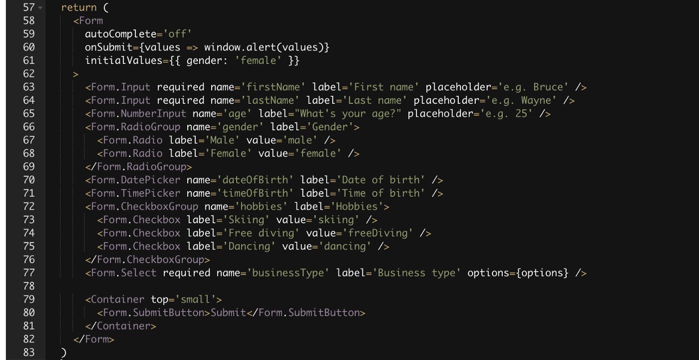
Make forms building effortless
It is not difficult to make the decision which components to build first — demand dictates priority. Naturally, layout and form elements are usually the first Components that any developer implements in the application. Layouts are not that hard, but forms do come with their own overhead. Most of the libraries that I’ve seen usually provide only the “dumb” Form components. Dumb not in a bad way, but in a way that you still have to handle all the user interactions on your own.
When I and the team were building a library we started with the same, however soon we realized that we can go a step further and abstract the entire form’s handling logic by utilizing the form handling library and providing ready-to-use Form components. No more messy onChange, value, error state handling, or other things that otherwise would require careful wiring every time you build a new form.
Experimenting yet providing stable API
While using semantic versioning we were still hesitant on bumping major library versions (i.e. from 13.0.3 to 14.0.0) especially with new experimental features that we add and later decide to change. We bumped into a dilemma — whether we should move fast and break things or keep stable API at all times and have much slower iterations on experimental components, since we couldn’t break API whenever we felt was right.
Thankfully we didn’t have to choose between either and we went with both. We took yet another idea from the MUI library — and introduced lab components.
The concept is simple — there are at least 2 packages for your library core and lab. Everything that’s in core — is considered stable and moves much more carefully. However, the lab package can change much more rapidly, since it’s primarily a place for all experimental features. You should expect many more breaking changes in the lab package, but that allows us, maintainers, to make more frequent adjustments, perfect the component and eventually move it to the core much faster.
Baked-in feedback capturing
In the next article I will share more details about — “How to manage development?”, and in particular talk about gathering feedback using a wide array of methods, however now I would like to mention at least one of the methods that can be baked in into your library.
Try to research tools that provide quick and seamless integration for web apps and enable feedback capturing on the spot. For us such a tool was Userback.
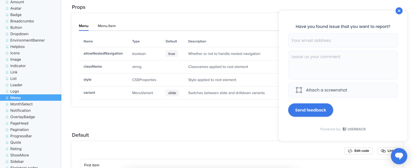
This tool allows anyone (engineers, designers, product people) to quickly and easily capture feedback and send it to a development team. It’s also possible to capture screenshots of the actual screen you are looking at (no extra software is needed) and make all sorts of annotations, leave extra comments and submit it with the written feedback.
The feedback is then sent to Userback where it can easily be processed. In addition, there are tons of ready-to-use integrations — slack, JIRA, Trello, just to name a few… All of which at the end of the day allows the team to react more quickly to the feedback reported.
Other tips for a better DX
Grouping components
Initially, this might not be needed, however with time, the number of components that your library holds will just grow and it’s best to figure out a good way to group them so it’s easier to find when the time comes.
Layout, Typography, Forms, Overlays, Charts, Widgets, Utils — just to name a few. The better grouping you will have, the easier it will be to find what someone is looking for.
Onboard new library users
We found that the best way to onboarding new library users is to provide certain tutorials of the most commonly used scenarios — such as “How to build a form?”, “How to use layout components?”, “How to use custom styling?”, etc…
Individual component layout principles
Over time we found that no standalone components should have predefined margins. Usually, it limits places where such components can be used leading to inline overrides of the margin values. Instead, we relied heavily on special Spacing components (used more for layouts) or usage of imported spacing values in style files and manually specifying correct values.
Exporting design utilities
It is impossible to provide every single component for every unique situation. In some cases, product developers needed to implement very specific components that should not be placed inside the library. However they may still want to use predefined spacing values, color palette, define custom responsive rules using common breakpoints, etc… Make sure you do allow to import all these values as standalone utils, this will make your library much more flexible.
Result
Even though it’s been a very long time since I’ve contributed, I’m still extremely proud of the library I’ve helped build — Picasso.

I do see things that I would like to improve, yet I still consider this library to be one of the best in the world in so many aspects that I shared above.
The last great bit about Picasso is that it is open-source — github.com/toptal/picasso! While you may not use this library in your projects, I encourage you to explore the code and find some ideas for your own library.